

Introduction
A cryptocurrency price chart is a visual record of continuous auction market dynamics, tracking the interaction between buyers (demand) and sellers (supply). Rather than functioning as a predictive crystal ball, a price chart provides an objective map of market psychology, liquidity positioning, and capital commitment. Transactions executed across trading venues leave an imprint on the chart, reflecting observed market prices and, on order-book venues, whether aggressive buyers are lifting offers or sellers are hitting bids.
To read a crypto chart with systematic discipline, market participants analyze four core structural elements:
- Price Action & Candlestick Anatomy: The relationship between open, high, low, and close (OHLC) prices that reveals localized conviction and price rejection.
- Market Structure & Geometry: The sequence of higher highs and higher lows (uptrends) or lower highs and lower lows (downtrends) establishing directional market structure.
- Volume & Order Flow Confirmation: The amount of trading activity behind a move, helping assess whether a breakout has meaningful participation or may be vulnerable to low-liquidity conditions.
- Mathematical Indicator Confluence: Overlaying trend-following tools (moving averages) and momentum oscillators (RSI, MACD) to filter noise and identify asymmetric risk-to-reward setups.
A central thesis of technical analysis is that no single indicator or candlestick pattern should ever be traded in isolation. High-confidence market decisions rely on confluence—the alignment of horizontal support and resistance, moving average regimes, volume confirmation, and momentum oscillators. Technical analysis does not predict future prices with absolute certainty; it establishes probabilistic edges paired with strict risk management frameworks to preserve capital across cyclical market regimes.
Executive Summary & Core Thesis
Quick Answer: How Do You Read a Crypto Price Chart?
To read a crypto price chart, begin by identifying the macro trend on higher timeframes (Daily or Weekly) using moving averages and market structure. Next, mark major horizontal support levels (where historical buying interest has stabilized price) and resistance levels (where selling pressure has emerged). Analyze Japanese candlesticks to evaluate immediate price action—noting whether large bodies signal conviction or long wicks indicate price rejection. Finally, validate price moves with trading volume and momentum indicators like the Relative Strength Index (RSI) to assess participation before calculating entry, stop-loss, and profit targets.
                      ┌─────────────────────────────────────────┐
                      │     THE 4 PILLARS OF CHART READING      │
                      └────────────────────┬────────────────────┘
                                           │
         ┌───────────────────┬─────────────┴───────┬───────────────────┐
         ▼                   ▼                     ▼                   ▼
┌─────────────────┐ ┌─────────────────┐   ┌─────────────────┐ ┌─────────────────┐
│ 1. PRICE ACTION │ │ 2. KEY LEVELS   │   │ 3. VOLUME DATA  │ │ 4. CONFLUENCE   │
├─────────────────┤ ├─────────────────┤   ├─────────────────┤ ├─────────────────┤
│ Candlestick OHLC│ │ Horizontal S/R, │   │ Volume bars     │ │ Moving averages,│
│ bodies show net │ │ trendlines, and │   │ show whether    │ │ RSI momentum, and │
│ progress; wicks │ dynamic moving    │   breakouts have    │ structural trends │
│ show localized  │ average baselines │   meaningful        │ align to validate │
│ price rejection │ on high timeframes│   participation     │ trade probability │
└─────────────────┘ └─────────────────┘   └─────────────────┘ └─────────────────┘
By viewing charts through this structured multi-variable lens, traders move past emotional impulses and analyze observable market behavior, as explored in our foundational manual on how stock prices are determined.
Foundational Definition: What Is a Price Chart? (Line vs. Bar vs. Candlestick)
A financial price chart plots price on the vertical Y-axis against time on the horizontal X-axis. Modern charting platforms provide three primary display formats, each offering different levels of market data:
                      ┌─────────────────────────────────────────┐
                      │    CHART FORMAT INFORMATION DENSITY     │
                      └────────────────────┬────────────────────┘
                                           │
         ┌───────────────────┬─────────────┴───────┬───────────────────┐
         ▼                   ▼                     ▼                   ▼
┌─────────────────┐ ┌─────────────────┐   ┌─────────────────┐
│ LINE CHART      │ │ OHLC BAR CHART  │   │ CANDLESTICK     │
├─────────────────┤ ├─────────────────┤   ├─────────────────┤
│ Plots close     │ │ Vertical bars   │   │ Developed in    │
│ prices only.    │ │ mark High/Low;  │   │ 18th-century    │
│ Simple to scan, │ │ left tick = Open│   │ Japan. Full OHLC│
│ but hides intra-│ │ right tick =    │   │ data with visual│
│ session range   │ │ Close price     │   │ body conviction │
└─────────────────┘ └─────────────────┘   └─────────────────┘
The Three Core Charting Formats:
- Line Chart: Connects closing prices over a chosen timeframe. While useful for identifying long-term macro trend trajectories without distracting intraday volatility, line charts omit critical data: the highest price buyers reached and the lowest price sellers explored during the session.
- OHLC Bar Chart: Displays a vertical line extending from the lowest to the highest price of the session, with a horizontal peg on the left indicating the opening price and a peg on the right marking the closing price.
- Japanese Candlestick Chart: Originating in 18th-century Japan to trade rice contracts, candlesticks pack the same four data points (Open, High, Low, Close) into a visually intuitive format. The expanded central rectangle—the real body—shows the net price movement between the open and close, while the candle’s full range and wicks provide additional context about price movement during the period, making it the widely used standard across crypto trading.
Candlestick Anatomy: Decoding Real Bodies and Rejection Wicks
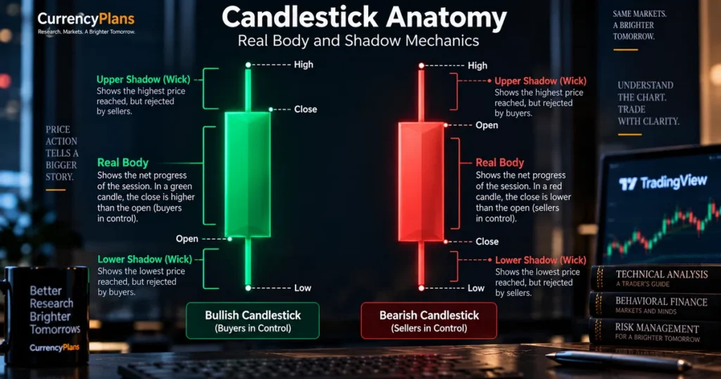
A single candlestick tells the micro-story of price interaction between buyers and sellers over a discrete unit of time (e.g., 1 hour, 1 day, or 1 week):
                   BULLISH CANDLE (GREEN)             BEARISH CANDLE (RED)

                     ┌─── High (Upper Wick)             ┌─── High (Upper Wick)
                     │                                  │
                 ┌───┴───┐                          ┌───┴───┐
                 │ Close │                          │ Open  │
                 │       │                          │       │
                 │ Real  │                          │ Real  │
                 │ Body  │                          │ Body  │
                 │       │                          │       │
                 │ Open  │                          │ Close │
                 └───┬───┘                          └───┬───┘
                     │                                  │
                     └─── Low (Lower Wick)              └─── Low (Lower Wick)
The Components of a Candlestick:
- The Real Body: The colored central portion bounded by the session’s Open and Close prices:
- Green (or White): The price closed higher than it opened, indicating net upward price movement during the period.
- Red (or Black): The price closed lower than it opened, indicating net downward price movement during the period.
- Body Size: A tall real body indicates strong directional progress between open and close. A compressed, narrow body indicates that the opening and closing prices were relatively close, often interpreted as hesitation or indecision when viewed in context.
- The Upper Shadow (Upper Wick): The thin line extending above the real body to the High of the session. It shows that price traded substantially above the close before ending the period lower, which traders often interpret as rejection of higher prices.
- The Lower Shadow (Lower Wick): The thin line extending below the real body to the Low of the session. It indicates that price moved substantially lower during the period but recovered before the close, which traders often interpret as rejection of lower prices.
Timeframe Hierarchy: From Macro Trend to Intraday Execution
A common pitfall among beginning traders is analyzing price action in a single, isolated timeframe. In market microstructure, higher timeframes generally provide broader structural context for lower-timeframe analysis:
+-------------------------------------------------------------------------------+
|                       THE TIMEFRAME OPERATIONAL MATRIX                        |
+-------------------+--------------------+------------------+-------------------+
| TIMEFRAME         | TIME HORIZON       | OPERATIONAL ROLE | MARKET AUDIENCE   |
+-------------------+--------------------+------------------+-------------------+
| **Monthly (1M)**  | Multi-Year Macro   | Identifies secular| Long-term macro   |
|                   |                    | market cycles    | allocators        |
| **Weekly (1W)**   | Multi-Month Trend  | Maps major S/R   | Swing & position  |
|                   |                    | structural zones | investors         |
| **Daily (1D)**    | Multi-Week Swings  | Core operational | Swing traders &   |
|                   |                    | trend baseline   | institutions      |
| **4-Hour (4H)**   | Multi-Day Swings   | Intermediate     | Active swing      |
|                   |                    | structure shifts | traders           |
| **1-Hour (1H)**   | Intraday Sessions  | Entry timing and | Day traders       |
|                   |                    | pattern triggers |                   |
| **15M / 5M**      | Intraday Scalping  | Execution & order| High-frequency    |
|                   |                    | flow precision   | scalpers          |
+-------------------+--------------------+------------------+-------------------+
The Top-Down Analysis Process:
- Macro Context (Monthly & Weekly): Determine the broader market trend. Is the asset in an expansionary bull markup, an accumulation base, or a macro downtrend, as outlined in our manual on crypto market cycles?
- Intermediate Structure (Daily): Identify major horizontal support and resistance levels, trendlines, and moving average regimes.
- Execution Timing (4-Hour & 1-Hour): Look for candlestick reversal patterns or breakout confirmations at higher-timeframe levels to optimize entry price and minimize stop-loss distance.
A bullish hammer on a 5-minute chart within a Daily downtrend is often just short-term market noise; that same hammer appearing at a major Monthly support level carries substantially greater structural weight.
Support & Resistance: Structural Floors and Ceilings
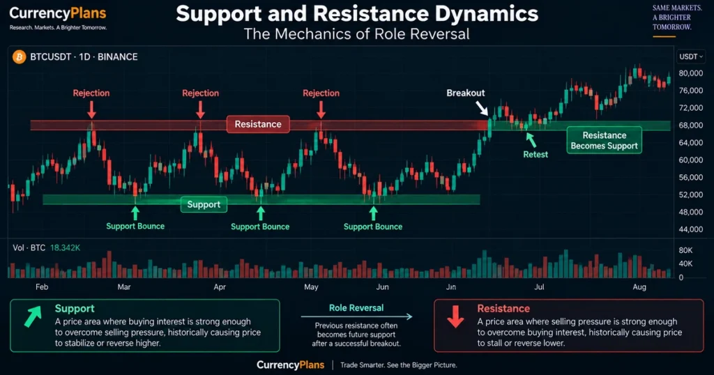
Support and resistance represent foundational technical concepts. They are price zones where historical buying or selling activity has repeatedly influenced price, causing movements to pause, stall, or reverse:
                      ┌─────────────────────────────────────────┐
                      │    SUPPORT AND RESISTANCE MECHANICS     │
                      └────────────────────┬────────────────────┘
                                           │
         ┌─────────────────────────────────┴─────────────────────────────────┐
         │                                                                   │
         ▼                                                                   ▼
┌──────────────────┐               ┌──────────────────────────────────┐
│ SUPPORT (DEMAND FLOOR)           │               │ RESISTANCE (SUPPLY CEILING)      │
├──────────────────┤               ├──────────────────────────────────┤
│ * Price zone where historical    │               │ * Price zone where historical    │
│   buying has stabilized declines │               │   selling has halted advances    │
│ * Buying activity clusters       │               │ * Profit-taking and selling clus.│
│ * Price repeatedly bounces       │               │ * Price repeatedly rejects       │
│ * If broken, shifts to resistance│               │ * If broken, shifts to support   │
└──────────────────┘               └──────────────────────────────────┘
The Principle of Role Reversal
When an established resistance level is decisively broken to the upside, it frequently transitions into future support—a phenomenon known as role reversal:
Resistance Zone ═══════════════[Breakout]══════════════════════════════
                                    │
                                    └─── Retest Holds --> Acts as New Support Floor
This occurs because market participants who sold at resistance often seek to adjust or close positions if the price retests their exit level, while breakout participants look to add exposure on pullbacks to the breakout zone.
Trendlines and Market Structure: Uptrends, Downtrends, and Consolidation
Market prices move through three distinct structural regimes: uptrends, downtrends, and sideways ranges:
                      ┌─────────────────────────────────────────┐
                      │       MARKET STRUCTURE GEOMETRY         │
                      └────────────────────┬────────────────────┘
                                           │
         ┌───────────────────┬─────────────┴───────┬───────────────────┐
         ▼                   ▼                     ▼                   ▼
┌─────────────────┐ ┌─────────────────┐   ┌─────────────────┐ ┌─────────────────┐
│ UPTREND         │ │ DOWNTREND       │   │ CONSOLIDATION   │ │ BREAK OF        │
│ (BULLISH)       │ │ (BEARISH)       │   │ (SIDEWAYS)      │ │ STRUCTURE (BOS) │
├─────────────────┤ ├─────────────────┤   ├─────────────────┤ ├─────────────────┤
│ Sequence of     │ │ Sequence of     │   │ Price oscillates│ Price breaks a    │
│ Higher Highs    │ │ Lower Highs     │   │ between fixed   │ relevant swing    │
│ (HH) and Higher │ │ (LH) and Lower  │   │ horizontal      │ high or low,      │
│ Lows (HL)       │ │ Lows (LL)       │   │ boundaries      │ indicating a      │
│                 │ │                 │   │ without a trend │ structural shift  │
│                 │ │                 │   │                 │ or continuation   │
└─────────────────┘ └─────────────────┘   └─────────────────┘ └─────────────────┘
Guidelines for Drawing Reliable Trendlines:
- Anchor Points: Traders commonly draw trendlines through two or more meaningful pivot points; additional touches can strengthen the visual significance of the line.
- Consistent Anchor Points: Trendlines should connect the extreme edges of candle wicks or real bodies consistently; cutting through significant real bodies invalidates the line.
- Angle and Sustainability: Extremely steep trendlines are often difficult to sustain over extended periods; evaluate them using price structure, timeframe, and volatility rather than a fixed chart angle.
Volume: The Order Flow Validator
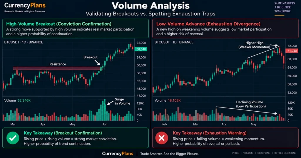
Price shows where the market traded; volume shows how much of the asset or contract changed hands during that move. Volume is one of the most widely used confirmation tools in technical analysis:
+-------------------------------------------------------------------------------+
|                        THE PRICE-VOLUME MATRIX                                |
+----------------------+--------------------+-----------------------------------+
| PRICE ACTION         | VOLUME BEHAVIOR    | INTERPRETATION                    |
+----------------------+--------------------+-----------------------------------+
| **Price Rising**     | **Volume Rising**  | **Stronger Participation:**       |
|                      |                    | Higher volume can support the     |
|                      |                    | view that advance has backing     |
| **Price Rising**     | **Volume Falling** | **Weaker Volume Confirmation:**   |
|                      |                    | Move may be vulnerable to         |
|                      |                    | exhaustion as volume wanes        |
| **Price Falling**    | **Volume Rising**  | **Stronger Participation:**       |
|                      |                    | Higher volume can support the     |
|                      |                    | view that decline has backing     |
| **Price Falling**    | **Volume Falling** | **Low Selling Pressure:** Orderly |
|                      |                    | pullback or consolidation         |
+----------------------+--------------------+-----------------------------------+
Spotting Low-Liquidity Moves with Volume:
When price attempts to break above a major resistance level on low, declining volume, it can indicate a breakout vulnerable to reversal or a low-liquidity move. A breakout is often considered more credible when volume expands materially relative to its recent baseline; traders may use different relative-volume thresholds depending on the market, timeframe, and strategy.
Moving Averages: Filtering Noise and Identifying Regime Shifts
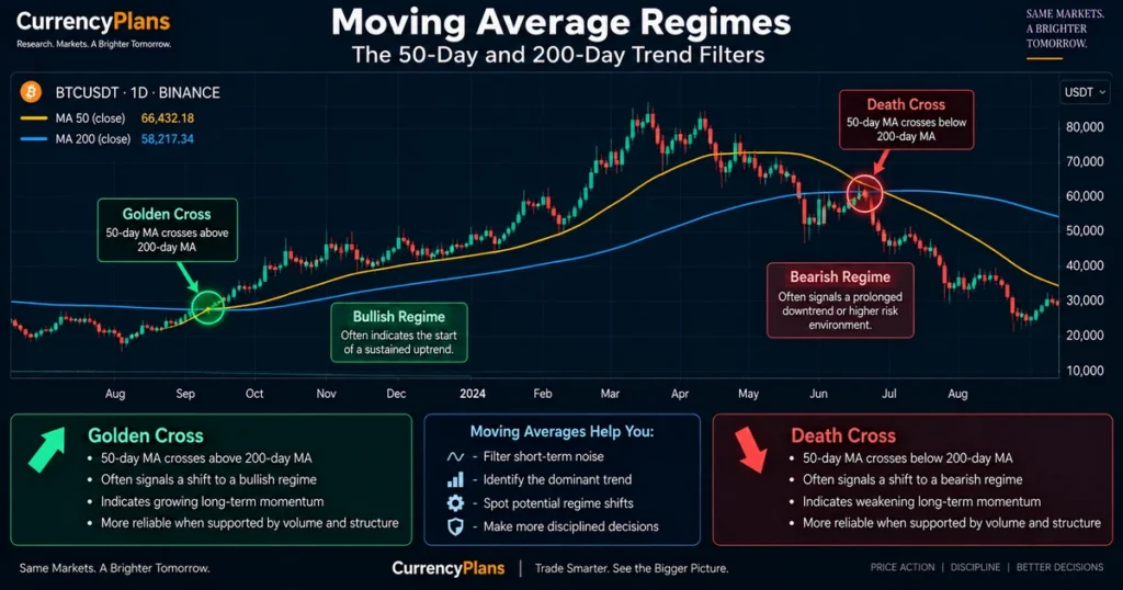
A moving average (MA) smooths out price fluctuations by calculating the average price over a specified number of periods. The two most common varieties are:
- Simple Moving Average (SMA): Applies equal mathematical weighting to every closing price within the period.
- Exponential Moving Average (EMA): Applies greater weighting to recent price data, reacting more quickly to short-term momentum shifts.
                      ┌─────────────────────────────────────────┐
                      │    COMMON MOVING AVERAGE BENCHMARKS     │
                      └────────────────────┬────────────────────┘
                                           │
         ┌─────────────────────────────────┴─────────────────────────────────┐
         │                                                                   │
         ▼                                                                   ▼
┌──────────────────────────────────┐               ┌──────────────────────────────────┐
│ THE 50-DAY MOVING AVERAGE        │               │ THE 200-DAY MOVING AVERAGE       │
├──────────────────┤               ├──────────────────────────────────┤
│ * Evaluates intermediate trend   │               │ * Widely watched reference for   │
│ * Acts as dynamic support during │                   longer-term trend direction    │
│   healthy mid-cycle pullbacks    │               │ * Often used as a broad multi-   │
│                                  │                   month trend benchmark          │
└──────────────────┘               └──────────────────────────────────┘
Golden Cross vs. Death Cross Mechanics:
- The Golden Cross: Occurs when the shorter-term 50-day MA crosses above the 200-day MA. Historically, this indicates that medium-term momentum is outpacing long-term trend baselines, which can indicate an emerging expansionary regime.
- The Death Cross: Occurs when the 50-day MA crosses below the 200-day MA. It is commonly interpreted as a sign of weakening intermediate-term trend conditions and can coincide with broader downtrends.
Relative Strength Index (RSI): Momentum, Overbought/Oversold, and Divergence
The Relative Strength Index (RSI)—developed by J. Welles Wilder—is a momentum oscillator that measures the velocity and magnitude of recent price changes on a scale bounded between 0 and 100:
         100 ┌─────────────────────────────────────────────────────────────
             │ Persistent Overbought Territory (>70)
          70 ├ - - - - - - - - - - - - - - - - - - - - - - - - - - - - - - -
             │ Bullish Momentum Baseline (>50)
          50 ├─────────────────────────────────────────────────────────────
             │ Bearish Momentum Baseline (<50)
          30 ├ - - - - - - - - - - - - - - - - - - - - - - - - - - - - - - -
             │ Deep Oversold Territory (<30)
           0 └─────────────────────────────────────────────────────────────
Common RSI Interpretations:
- Overbought (> 70): Indicates price has advanced rapidly relative to historical baselines. In strong trending bull markets, RSI can remain elevated above 70 for extended periods without signaling an immediate market top.
- Oversold (< 30): Indicates aggressive selling velocity. In prolonged bear markets, RSI can remain depressed below 30 as liquidations cascade.
- Centerline (50): The 50 level acts as a baseline: readings consistently above 50 signal that average gains outweigh average losses, while readings below 50 reflect bearish momentum.
The Dynamics of RSI Divergence:
Divergence occurs when underlying price action and the RSI oscillator decouple, signaling momentum exhaustion:
BULLISH DIVERGENCE:
Price Chart:   Swing Low ───────> Lower Low (Price drops)
RSI Indicator: Swing Low ───────> Higher Low (Momentum rises!)
Conclusion:    Downside momentum is weakening, creating a potential reversal
               signal that requires confirmation.

BEARISH DIVERGENCE:
Price Chart:   Swing High ──────> Higher High (Price rises)
RSI Indicator: Swing High ──────> Lower High (Momentum falls!)
Conclusion:    Upside momentum is weakening, creating a potential exhaustion
               signal that requires confirmation.
Moving Average Convergence Divergence (MACD): Trend and Momentum Synergy
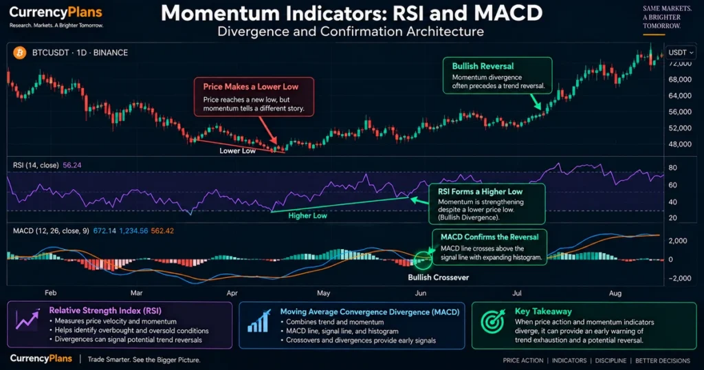
The MACD indicator blends trend-following and momentum characteristics by calculating the difference between two exponential moving averages:
$$\text{MACD Line} = 12\text{-Period EMA} – 26\text{-Period EMA}$$
$$\text{Signal Line} = 9\text{-Period EMA of the MACD Line}$$
$$\text{MACD Histogram} = \text{MACD Line} – \text{Signal Line}$$
                      ┌─────────────────────────────────────────┐
                      │       MACD OPERATIONAL MECHANICS        │
                      └────────────────────┬────────────────────┘
                                           │
         ┌───────────────────┬─────────────┴───────┬───────────────────┐
         ▼                   ▼                     ▼                   ▼
┌─────────────────┐ ┌─────────────────┐   ┌─────────────────┐ ┌─────────────────┐
│ BULLISH CROSS   │ │ BEARISH CROSS   │   │ HISTOGRAM       │ │ ZERO-LINE       │
│ (BUY MOMENTUM)  │ │ (SELL MOMENTUM) │   │ EXPANSION       │ │ CROSSOVER       │
├─────────────────┤ ├─────────────────┤   ├─────────────────┤ ├─────────────────┤
│ Fast MACD line  │ │ Fast MACD line  │   │ Expanding bars  │ Crossing above    │
│ crosses above   │ │ crosses below   │   │ show widening   │ zero indicates    │
│ Signal line     │ │ Signal line     │   │ difference      │ fast EMA has      │
│ from below      │ │ from above      │   │ between MACD &  │ moved above slow  │
│                 │ │                 │   │ signal line     │ EMA               │
└─────────────────┘ └─────────────────┘   └─────────────────┘ └─────────────────┘
When used alongside horizontal support and resistance, MACD crossovers help assess whether an observed price bounce has the momentum to develop into a sustained trend.
Candlestick Patterns: Single, Dual, and Triple Formations
Candlestick formations provide clues about localized supply and demand shifts:
+---------------------------------------------------------------------------------------------------+
|                           6 ESSENTIAL CANDLESTICK PATTERNS                                        |
+---------------------+-------------------+---------------------+-----------------------------------+
| PATTERN NAME        | FORMATION TYPE    | VISUAL STRUCTURE    | MARKET DYNAMICS                   |
+---------------------+-------------------+---------------------+-----------------------------------+
| **Hammer**          | Potential Bullish | Small upper body;   | Price traded lower during the     |
|                     | Reversal (at S/R) | long lower wick     | session but recovered toward close|
| **Shooting Star**   | Potential Bearish | Small lower body;   | Price reached higher highs but    |
|                     | Reversal (at S/R) | long upper wick     | was rejected back toward the open |
| **Bullish**         | Bullish Reversal  | Large green candle  | Second candle's real body covers  |
| **Engulfing**       | (At Support)      | wraps prior body    | preceding body; bullish shift     |
| **Bearish**         | Bearish Reversal  | Large red candle    | Second candle's real body covers  |
| **Engulfing**       | (At Resistance)   | wraps prior body    | preceding body; bearish shift     |
| **Doji**            | Indecision /      | Open and Close are  | Small difference between open and |
|                     | Transition        | virtually identical | close; shows market hesitation    |
| **Morning Star**    | 3-Bar Bullish     | Tall red -> Doji -> | Severe selling gives way to pause,|
|                     | Reversal Base     | Strong green candle | followed by strong bullish candle |
+---------------------+-------------------+---------------------+-----------------------------------+
Golden Rule of Patterns: Candlestick patterns should never be traded in isolation. A bullish hammer formed in the middle of a consolidation range has low statistical significance; that same hammer appearing at a major 200-day moving average support level provides stronger contextual confluence when combined with the broader trend and other confirmation signals.
Classical Chart Patterns: Triangles, Flags, and Reversal Formations
Beyond individual candlesticks, multi-week price movements can form geometric patterns that reflect changing market balance, consolidation, and breakout pressure:
                      ┌─────────────────────────────────────────┐
                      │    CLASSICAL CHART GEOMETRY SPECTRUM    │
                      └────────────────────┬────────────────────┘
                                           │
         ┌───────────────────┬─────────────┴───────┬───────────────────┐
         ▼                   ▼                     ▼                   ▼
┌─────────────────┐ ┌─────────────────┐   ┌─────────────────┐ ┌─────────────────┐
│ ASCENDING       │ │ DESCENDING      │   │ BULL FLAG       │ │ HEAD &          │
│ TRIANGLE        │ │ TRIANGLE        │   │ (CONTINUATION)  │ │ SHOULDERS       │
├─────────────────┤ ├─────────────────┤   ├─────────────────┤ ├─────────────────┤
│ Flat horizontal │ │ Flat horizontal │   │ Sharp upward    │ Three successive  │
│ resistance with │ │ support with    │   │ "pole" advance  │ peaks with the    │
│ ascending higher│ descending lower  │   │ followed by a   │ central peak being│
│ lows (Bullish)  │ highs (Bearish)   │   │ downward channel│ highest (Top Rev) │
└─────────────────┘ └─────────────────┘   └─────────────────┘ └─────────────────┘
Measuring Potential Price Targets: For classical patterns such as triangles and flags, traders often calculate potential target projections by measuring the height of the pattern (the flag pole or triangle base) and projecting that distance from the breakout point.
The Confluence Framework: Synthesizing S/R, Volume, MAs, and Momentum
Disciplined technical analysis relies on confluence—the alignment of independent technical variables at a single price zone:
                      ┌─────────────────────────────────────────┐
                      │    THE 4-POINT CONFLUENCE CHECKLIST     │
                      └────────────────────┬────────────────────┘
                                           │
         Point 1: Major Horizontal Support Level Tested (Historical Demand)
                                           │
         Point 2: Confluence with Moving Average (e.g., 50 or 200 EMA)
                                           │
         Point 3: Reversal Candlestick Formed (e.g., Hammer / Engulfing)
                                           │
         Point 4: Momentum Oscillator Confirmation (e.g., RSI Bullish Divergence)
                                           │
                                           ▼
                 HIGHER-CONFIDENCE TRADE THESIS WITH DEFINED RISK
When multiple independent or complementary signals align at the same price area, the setup may strengthen the trade thesis while providing clear levels for localized risk management.
Trading Style Profiles: Selecting the Operational Timeframe
Traders align their operational timeframe with their risk tolerance, schedule, and capital base:
+---------------------------------------------------------------------------------------------------+
|                        TRADING STYLE PROFILES & EXECUTION MATRICES                                |
+-------------------+--------------------+--------------------+-------------------------------------+
| TRADING STYLE     | PRIMARY TIMEFRAME  | TYPICAL HOLD TIME  | PRIMARY TECHNICAL TOOLKIT           |
+-------------------+--------------------+--------------------+-------------------------------------+
| **Scalper**       | 1-Min to 15-Min    | Minutes to Hours   | Order book flow, VWAP, Level-2 data |
| **Day Trader**    | 15-Min to 1-Hour   | Intraday Sessions  | S/R breaks, VWAP, session volume    |
| **Swing Trader**  | 4-Hour to Daily    | Days to Weeks      | Market structure, RSI, 50/200 MAs   |
| **Position**      | Daily to Weekly    | Weeks to Months    | 200-day MA, macro trendlines, cycles|
| **Investor**      | Weekly to Monthly  | Months to Years    | Long-term trend, valuation, cycles  |
+-------------------+--------------------+--------------------+-------------------------------------+
The 7 Common Technical Analysis Mistakes Beginners Make
- Trading Without a Defined Stop-Loss: Entering market positions without calculating an explicit exit price where the trade idea is invalidated.
- Ignoring Higher-Timeframe Context: Buying a bullish 5-minute pattern directly into major Weekly resistance.
- Indicator Overload: Crowding a chart with 10 different indicators that produce conflicting signals (paralysis by analysis).
- Treating RSI Extremes as Immediate Reversals: Shorting assets simply because RSI is above 70 during powerful, liquidity-driven bull markup runs.
- Drawing Support Lines Everywhere: Creating dozens of horizontal lines until the chart becomes unreadable. Focus on major pivot levels with multiple touches.
- Revenge Trading: Increasing position size immediately after a losing trade to recover capital quickly, bypassing disciplined risk management.
- Neglecting Bitcoin Dominance: Trading small-cap altcoins without monitoring whether capital is actively fleeing into Bitcoin or stablecoins.
Capital Preservation: Position Sizing and Risk-to-Reward Architecture
Technical analysis is not about being right on every trade; it is about ensuring that winning trades yield substantially more than losing trades subtract:
$$\text{Position Size} = \frac{\text{Account Capital} \times \text{Risk Percentage}}{\vert{}\text{Entry Price} – \text{Stop-Loss Price}\vert{}}$$
                      THE 1:3 RISK-TO-REWARD RATIO ARCHITECTURE

       Entry: $60,000  |  Stop-Loss: $58,000 (Risk: $2,000)  |  Target: $66,000 (Reward: $6,000)

       In this simplified 10-trade example, a 30% win rate with a 1:3 risk-to-reward
       ratio produces a positive result before fees, slippage, taxes, and other trading costs:
       10 Trades: 7 Losses (-$14,000) + 3 Wins (+$18,000) = +$4,000 Gross Result!
Some risk-management frameworks use a 1% to 2% risk-per-trade range as an illustrative guideline, but appropriate sizing depends on the trader, strategy, liquidity, and risk tolerance.
TradingView Practical Setup Guide: Configuring a Clean Layout
To configure a clean, functional workspace on TradingView:
- Chart Configuration: Select Candlesticks from the top toolbar. Use the display theme that is most comfortable for extended sessions.
- Add Primary Indicators: Search and apply:
- Volume (Built-in indicator; set moving average length to 20).
- Moving Average Exponential (EMA) (Add two instances: set inputs to 50 and 200).
- Relative Strength Index (RSI) (Set length to 14; verify bands are marked at 70, 50, and 30).
- Drawing Tools Organization: Favorite the Horizontal Ray (for support/resistance), Trendline, and the Risk/Reward Position Tool.
- Automated Alerts: Configure price alerts at major structural support and resistance levels to avoid the need to monitor screens continuously.
Microstructure Differences: Crypto Charts vs. Traditional Stock Charts
While technical analysis principles apply across all auction markets, cryptocurrency charts carry distinct structural characteristics:
+-------------------------------------------------------------------------------+
|                      CRYPTO VS. TRADITIONAL ASSET MARKETS                     |
+----------------------+-----------------------------+--------------------------+
| STRUCTURAL FEATURE   | CRYPTOCURRENCY CHARTS       | TRADITIONAL EQUITY CHARTS|
+----------------------+-----------------------------+--------------------------+
| **Trading Schedule** | Generally continuous 24/7   | Fixed trading sessions;  |
|                      | trading; no regular session | frequent overnight gaps  |
|                      | close                       |                          |
| **Volatility Scale** | Generally higher realized   | Regulated volatility;    |
|                      | volatility; wider wicks     | localized daily ranges   |
| **Circuit Breakers** | No single standardized      | Market-wide circuit      |
|                      | market-wide breaker regime; | breakers at 7%, 13%, and |
|                      | venue controls may apply    | 20% S&P 500 declines     |
| **Leverage Engine**  | Perpetual futures with      | Exchange-traded futures  |
|                      | periodic funding rates      | and options with defined |
|                      | (commonly 8-hour intervals) | expiration dates         |
+----------------------+-----------------------------+--------------------------+
Practical Comparison: Multi-Asset Cycle Allocation Modeling
To illustrate how institutional allocators examine risk exposure across different market regimes, review this educational, non-prescriptive asset allocation framework:
+---------------------------------------------------------------------------------------------------+
|               ILLUSTRATIVE MULTI-ASSET EXPOSURE ACROSS REGIMES (EDUCATIONAL ONLY)                 |
+-------------------+--------------------+--------------------+--------------------+----------------+
| CYCLE REGIME      | CORE BITCOIN (BTC) | LARGE-CAP ASSETS   | SPECULATIVE ALTS   | CASH / T-BILLS |
+-------------------+--------------------+--------------------+--------------------+----------------+
| **Accumulation**  | Higher relative    | Moderate allocation| Selective or       | Elevated cash  |
|                   | focus              |                    | minimal            | reserves       |
| **Markup**        | Core foundational  | Increasing weight  | Selective,         | Lower cash     |
|                   | asset              |                    | tactical exposure  | allocation     |
| **Distribution**  | De-risking and     | Locking in capital | Substantially      | Increasing cash|
|                   | taking profit      | gains              | reduced            | buffers        |
| **Markdown**      | Defensive or core  | Reduced            | Minimal or zero    | Highest cash / |
|                   | holding only       |                    |                    | capital defense|
+-------------------+--------------------+--------------------+--------------------+----------------+
Disclaimer: This matrix represents an illustrative conceptual framework for educational analysis and does not constitute personalized investment advice or portfolio management instructions.
Synthesizing Price Charts with On-Chain Network Fundamentals
While price charts reflect secondary market price action, combining them with on-chain blockchain metrics provides a clearer picture of network participant behavior:
                      ┌─────────────────────────────────────────┐
                      │    THE DUAL TECHNICAL-ON-CHAIN LENS     │
                      └────────────────────┬────────────────────┘
                                           │
         ┌─────────────────────────────────┴─────────────────────────────────┐
         │                                                                   │
         ▼                                                                   ▼
┌──────────────────────────────────┐               ┌──────────────────────────────────┐
│ TECHNICAL PRICE CHART            │               │ ON-CHAIN BLOCKCHAIN METRICS      │
├──────────────────┤               ├──────────────────────────────────┤
│ * Where the price is trading     │               │ * Wallet, holder, transfer flows │
│ * Immediate momentum and trend   │               │ * MVRV: Market vs Realized Value │
│ * Localized support and resistance│              │ * Unrealized net profits (NUPL)  │
│ * Chart patterns and wicks       │               │ * Long-term holder distribution  │
└──────────────────┘               └──────────────────────────────────┘
When a technical chart indicates price is testing a major multi-year support level at the same time on-chain metrics show the MVRV Ratio dropping below 1.0, traders observe confluence between market price and on-chain valuation metrics.
Common Myths vs. Empirical Facts
- Myth: Technical analysis allows you to predict future prices with certainty.
- Fact: Technical analysis is a study of probability and risk management, not a deterministic prediction engine.
- Myth: The more indicators you add to a chart, the more accurate your signals become.
- Fact: Overloading a chart with multiple indicators creates conflicting noise. Many analysts combine price action, volume, and a small number of complementary tools rather than relying on a heavily crowded chart.
- Myth: Support levels can never break once confirmed.
- Fact: Support levels represent areas of concentrated buying interest, but if supply overwhelms demand, support breaks and often transitions into resistance.
- Myth: RSI above 70 means you should short the market immediately.
- Fact: Strong expansionary bull regimes can keep RSI pinned above 70 for weeks at a time. Entering short positions based solely on overbought readings during a macro bull market is a common trader error.
- Myth: Chart patterns work identically across every timeframe.
- Fact: Patterns on 1-minute or 5-minute charts contain substantial random market noise. Higher-timeframe patterns (Daily and Weekly) generally provide more context and may be less affected by short-term market noise.
Frequently Asked Questions
What is the most important indicator for reading crypto charts?
Volume is one of the most critical technical tools because it measures trading activity behind price movements. Moving averages (50 and 200 EMA) and the Relative Strength Index (RSI) serve as foundational secondary indicators.
What is the difference between support and resistance?
Support is a price floor where buying interest historically clusters to halt downward advances. Resistance is a price ceiling where selling pressure and profit-taking historically overwhelm buyers.
What does a candlestick with a long wick mean?
A long wick indicates that price traveled significantly beyond the eventual closing level during the period. A long upper wick shows that price traded substantially higher before closing lower, while a long lower wick shows that price traded substantially lower before recovering toward the close.
How do I use the 50-day and 200-day moving averages?
When the price trades above both moving averages, the trend is commonly interpreted as bullish; when below, the trend is commonly viewed as bearish. A 50-day MA crossing above the 200-day MA forms a “Golden Cross,” signaling positive medium-term momentum.
What is a bullish divergence on RSI?
A bullish divergence occurs when the price records lower lows while the RSI oscillator forms higher lows, indicating that downward price momentum is weakening and setting up a potential reversal that requires confirmation.
What timeframe is commonly recommended for beginners?
The Daily (1D) and 4-Hour (4H) timeframes are widely used educational defaults because they filter out intraday market noise while providing clear structural support and resistance levels.
What is a “Break of Structure” (BOS)?
A Break of Structure occurs when price breaks a relevant swing high or low, indicating a structural shift or continuation depending on the prevailing trend direction and context.
Why does crypto technical analysis differ from traditional stocks?
Cryptocurrency markets trade 24 hours a day, 7 days a week, with no regular session close, higher realized volatility, and no standardized market-wide circuit breakers.
What is an engulfing candle?
An engulfing formation is a two-candle reversal pattern where the real body of the second candle completely covers the real body of the preceding candle, indicating a potential shift in market momentum.
Can news events invalidate technical analysis?
Yes. Unanticipated macroeconomic data, regulatory actions, or systemic liquidations can override localized technical patterns, which is why strict stop-loss orders are necessary for capital preservation.
What is the MACD indicator used for?
The MACD tracks trend direction and momentum by calculating the difference between short-term and long-term exponential moving averages, using signal line crossovers to identify momentum shifts.
How much capital should I risk per trade?
Some risk-management frameworks use a 1% to 2% of total trading capital range as an illustrative guideline for individual trade risk, but appropriate sizing depends on the strategy, market conditions, liquidity, and individual risk tolerance.
Strategic Summary & Core Takeaways
Mastering cryptocurrency price charts requires treating technical analysis as a probabilistic framework rather than a predictive system:
- Candlesticks Reflect Auction Dynamics: Bodies show directional progress between open and close; upper and lower wicks reveal localized price rejection.
- Respect the Timeframe Hierarchy: Establish macro direction on Weekly and Daily charts before planning entries on lower timeframes.
- Volume Validates Price: Avoid assuming a breakout is durable if it occurs on low or declining volume.
- Seek Indicator Confluence: Look for setups where horizontal levels, moving average regimes, and momentum indicators align.
- Manage Risk Above All Else: A reliable technical strategy paired with poor position sizing leads to capital depletion. Define entries, stop-losses, and profit targets before entering the market.
Next Reading Suggestions
- Crypto Market Cycles: The Complete Guide to Bitcoin Halvings, Global Liquidity, On-Chain Metrics, and Alt Seasons
- What Is Bitcoin? The Complete Guide to the First Decentralized Digital Currency
- How Stock Prices Are Determined: Market Microstructure, Supply and Demand, and Valuation
- What Is the Stock Market? How Global Equity Markets Work and Allocate Capital
- Fed Rate Cuts & Global Liquidity: The Complete Guide to Interest Rates, the Fed Balance Sheet, and Asset Markets
- What Is Crypto Mining? A Complete Guide to Proof of Work, ASICs, Pools, and Energy Economics
- What Is a Crypto Wallet? A Complete Guide to Keys, Security, and Storage Types
- What Is Ethereum? The Complete Guide to Smart Contracts, EVM, Staking, and Layer 2 Rollups
- What Is Blockchain? The Complete Guide to Distributed Ledger Technology, Consensus, and Smart Contracts
- What Is Crypto? The Complete Guide to Cryptocurrency, Blockchain, and Digital Assets
- What Are Stocks? The Complete Guide to Shares, Equity, and Ownership
- What Is Market Capitalization? The Complete Guide to Market Cap, Company Size, and Valuation
- What Is Gold? The Complete Guide to Real Money, Store of Value & Why It Matters
- Interest Rates and Exchange Rates: The Complete Guide to Global Currency Pricing
Author Box & E-E-A-T Verification
Written & Researched By: CurrencyPlans Editorial Research Team
Editorial Review: This technical analysis manual covers classical charting concepts, indicator mathematics, market structure, and volume-based analysis using established educational resources from the Chartered Market Technician (CMT) Association, TradingView documentation, and market-data providers.
Educational References & Market Data Sources
For technical analysis methodologies, indicator formulas, and market data specifications, consult the following industry documentation, educational resources, and market-data sources directly:
- Chartered Market Technician (CMT) Association Educational Standards: CMT Association
- Technical Indicator Calculations & Charting Documentation: TradingView Knowledge Base
- Financial Education & Market Microstructure Concepts: Investopedia Financial Education
- Cryptocurrency Derivatives & Open Interest Data: CoinGlass Analytics
- On-Chain Valuation Metrics & Supply Profiling: Glassnode Studio
- Behavioral Sentiment & Market Gauges: Alternative.me Crypto Fear & Greed Index
Educational Disclaimer
This guide is prepared strictly for educational, research, and informational purposes and does not constitute personalized financial, investment, trading, or tax advice. Technical analysis involves probability assessment rather than certain prediction; cryptocurrency trading carries significant capital risk, volatility, and leverage exposure. Past chart patterns, technical indicators, and historical support and resistance levels do not guarantee future market outcomes. Always perform independent due diligence and consult a licensed financial advisor before committing trading capital.

